Sesh+

Sesh+ is an independently-owned smoke-free nicotine pouch brand born in Sweden and made in America.

Services:

Brand Strategy
Brand Voice
Brand Identity
Packaging
Content Creation

sesh

The Truffl

The nicotine pouch category is currently dominated by big tobacco subsidiaries and competitors trading in juvenile posturing. What’s missing is a brand that treats adults like adults—offering genuine quality, superior flavor, and real support through behavioral change.

Sesh recognized an opportunity to own the honest, performance-driven position in a market. The insight was clear: if you’re going to help someone overcome the obstacles of quitting smoking or upgrading their habits, you need to meet them with respect, not gimmicks. You need a product that performs, flavors that delight, and a brand that stands for something real. Backed by celebrity tastemakers ranging from Post Malone and Diplo to the Jonas Brothers, Sesh signals a shift in how the category is perceived. This isn’t youth culture. This is quality culture.

Brand Strategy & Voice

The strategy crystallizes around a single, powerful idea: “Nicotine. Upgraded.”

This isn’t about incremental product improvement. It’s about upgrading your entire relationship with nicotine—from how it feels to support your moments of focus and achievement. The brand connects unrivaled product benefits to real emotional and life goals. Quality, precision strength, superior flavors, premium ingredients, and extended satisfaction aren’t marketing language. They’re functional promises designed to keep you in the zone through the moments that matter most. The voice is direct and honest proving that sometimes restraint sells better than hype. 

Brand Identity

The visual identity is intentionally minimal—designed to communicate the product itself: clean, pharmaceutical-grade, and intentional. Every element is earned. The core mark, “sesh+,” introduces the plus symbol as a dual expression. It’s literally “plus nicotine”—an addition to your moment. More importantly, it signals upgrade. The symbol becomes a repeating graphic device throughout the system.


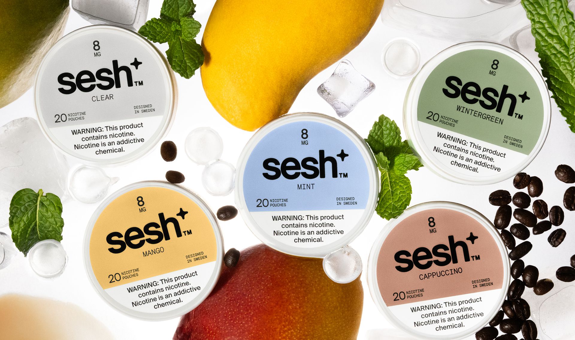
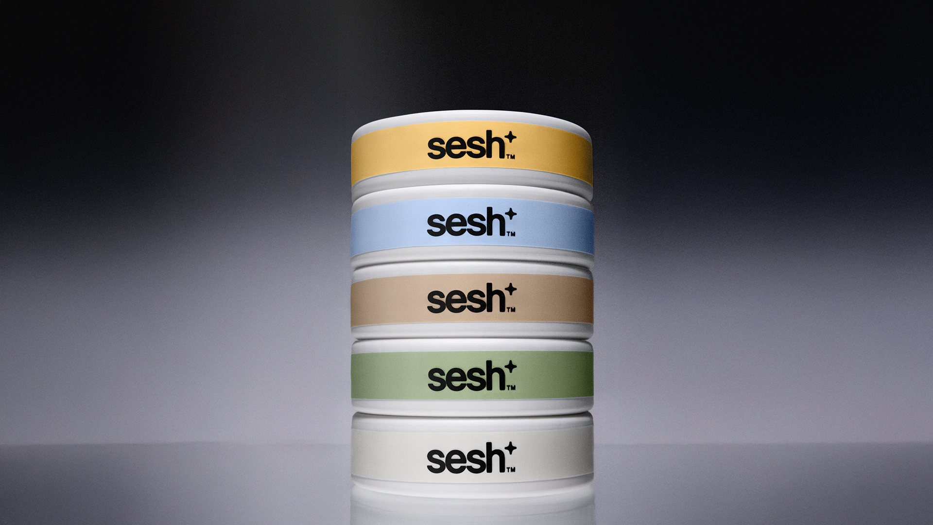
Typography uses Suisse Int’l Light and Medium for headlines and emphasis, paired with Suisse Int’l Light for body copy and captions. Basis Mono anchors subheads and slugs in all capitals. The typeface family is clean and pedagogical—it prioritizes clarity and legibility. This is a brand built on functionality, and the type system supports that without unnecessary decoration. The color palette is where the brand breathes. Rather than a chaotic spectrum, each flavor receives its own deliberate, tasteful color field: warm yellows for Mango, soft periwinkles for Mint, warm taupes for Cappuccino, sage greens for Wintergreen, and crisp whites for Clear. 


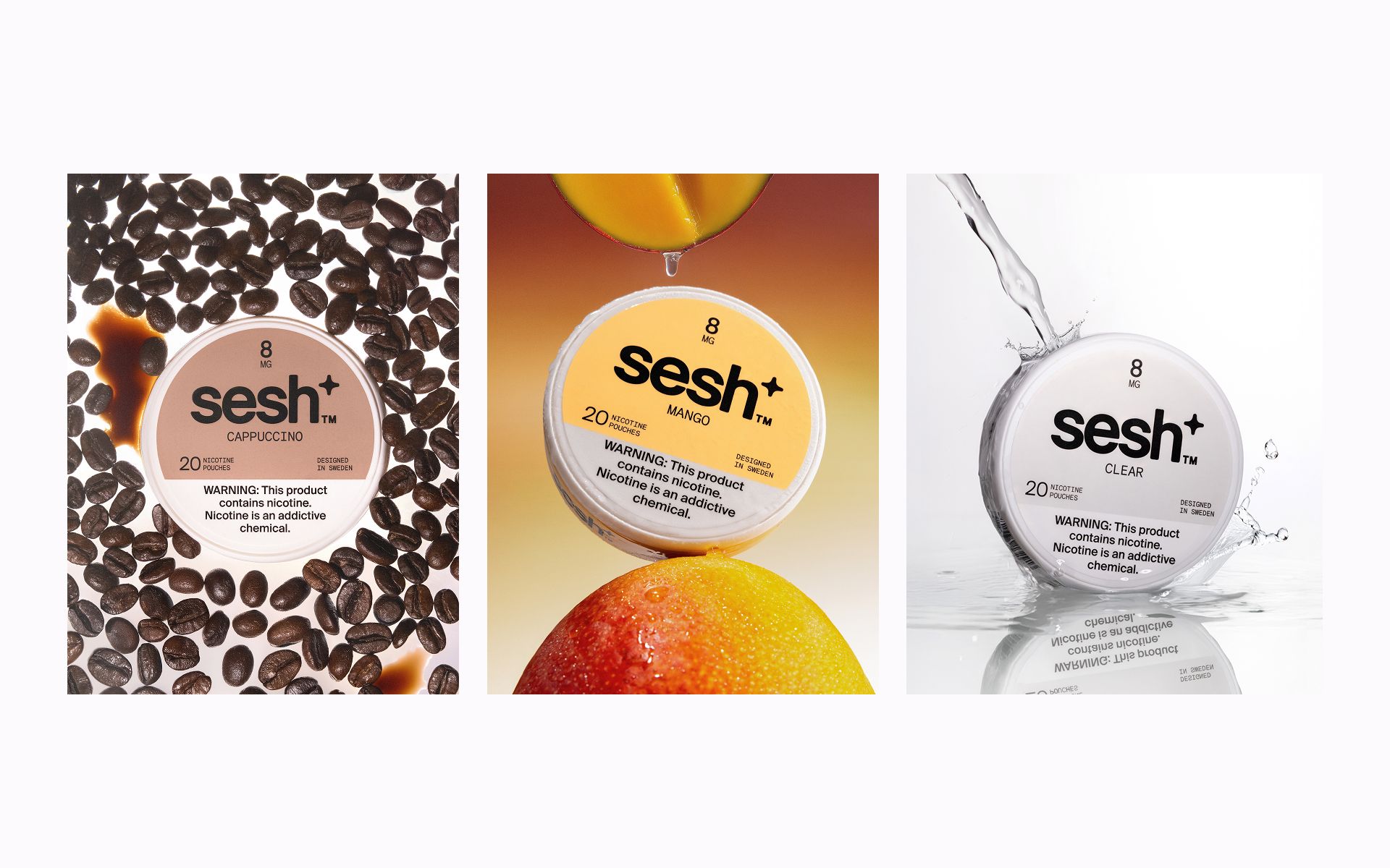
Packaging design is minimalist. The circular pouch container features bold, centered branding with the color field occupying the upper portion, while instructional and warning copy sits below in a clean hierarchy. White exterior creates neutral, elevated shelf presence—standing apart visually from the category’s visual noise. Photography is deliberately understated with lifestyle shots showing the product in sparse, carefully composed contexts—ice, fresh herbs, coffee beans, citrus. Motion graphics reinforce the plus symbol and product benefits through elegant, purposeful animation.

brand identity
sesh 15 stack all horizontal

Working with TRUFFL has been one of the most seamless and high-impact creative partnerships. They were able to navigate the uniquely challenging, highly regulated tobacco and nicotine space with a level of strategic clarity and design sophistication that’s incredibly rare. Our category comes with demanding packaging requirements and strict compliance parameters, yet TRUFFL delivered work that not only met every constraint but elevated our brand far beyond expectations. They understood our vision, moved fast, and executed at a world-class level.

Josh Metz, Sesh+ | Chief Marketing Officer