

Stay up to date with Truffl
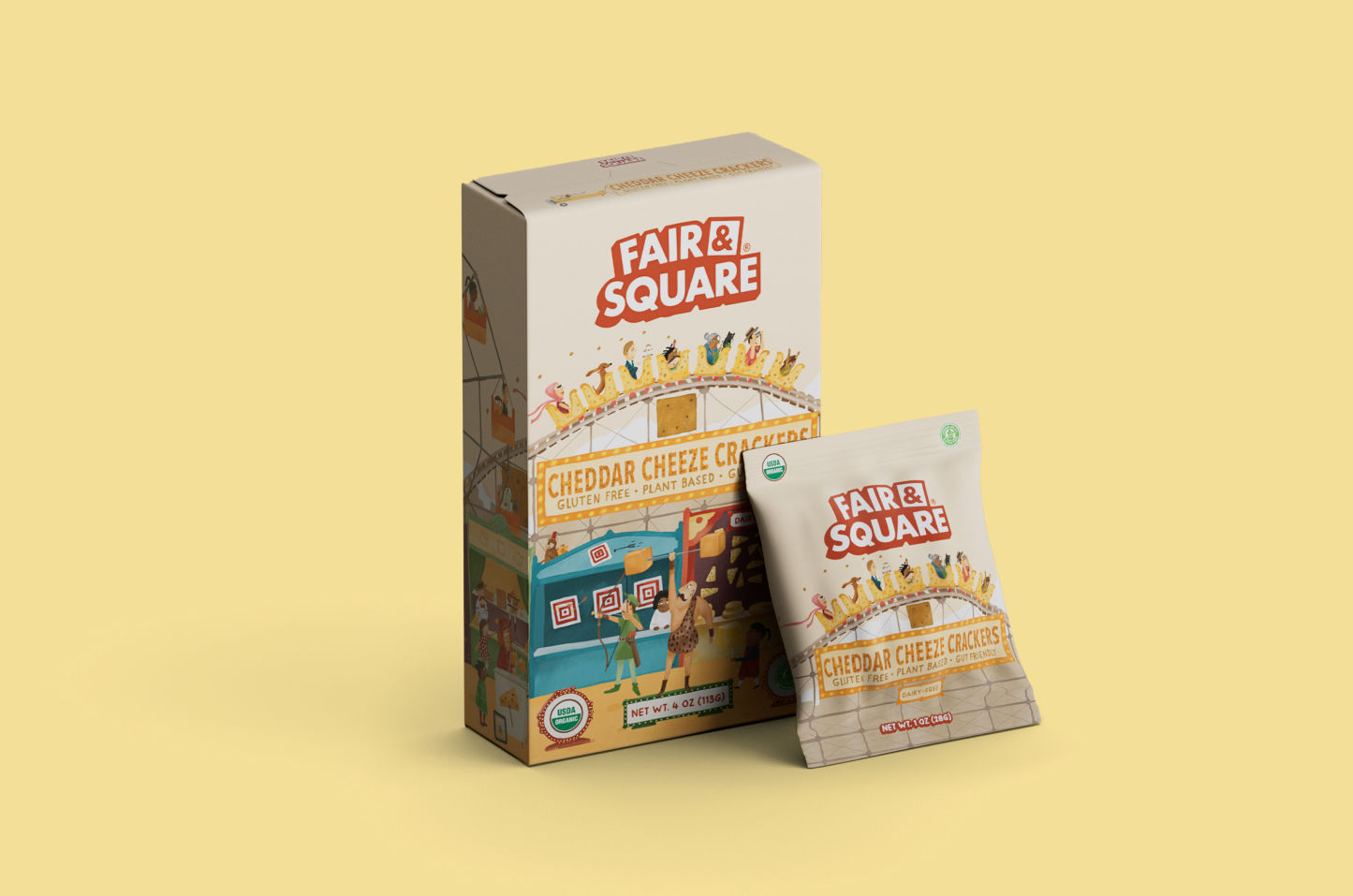
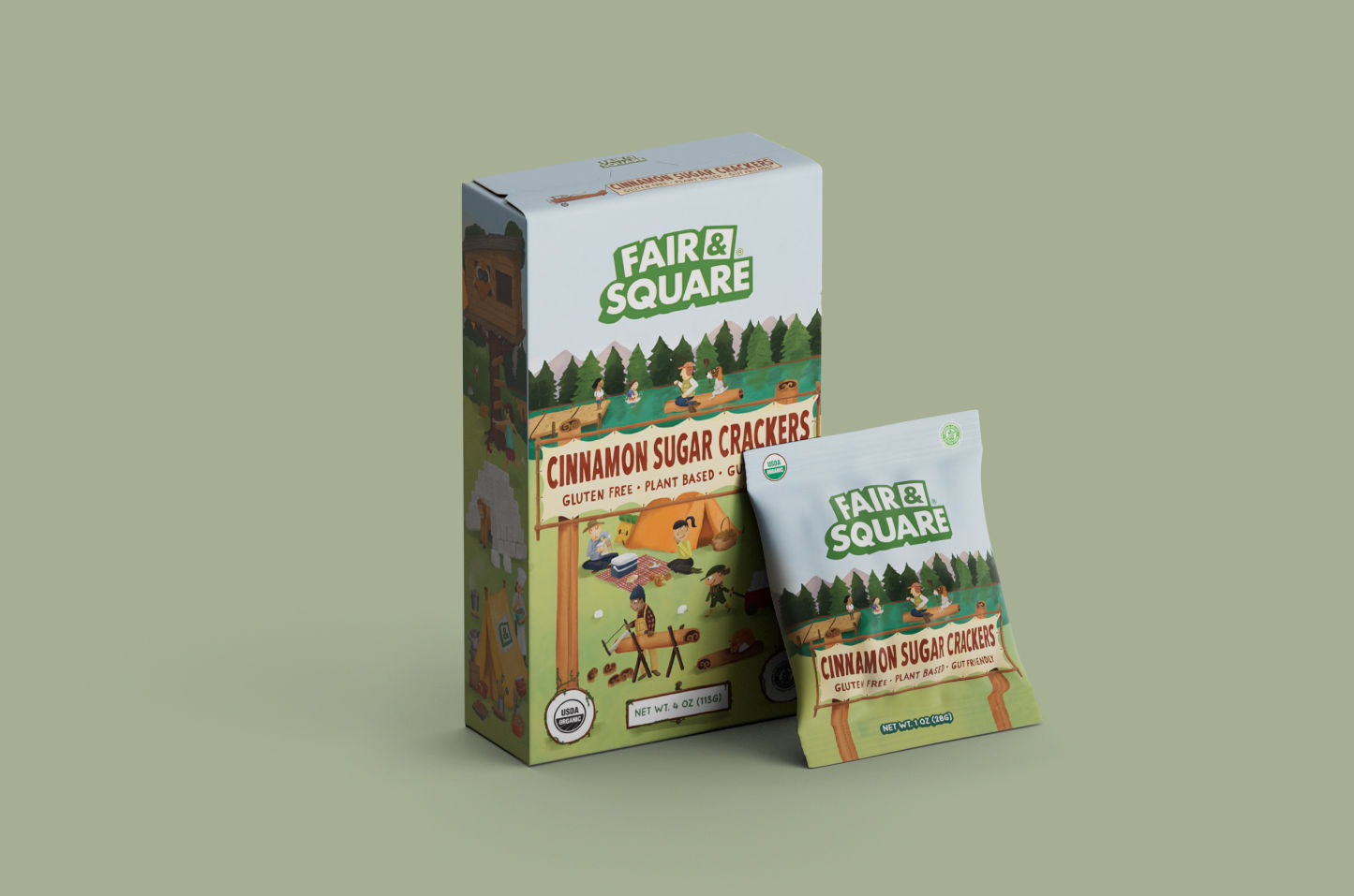
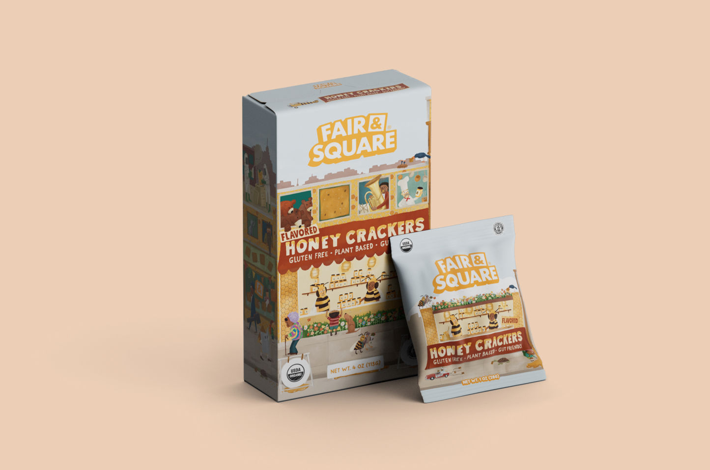
Other work
Casalena
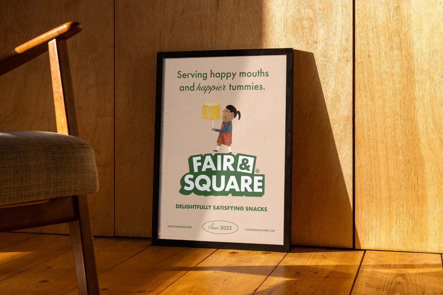
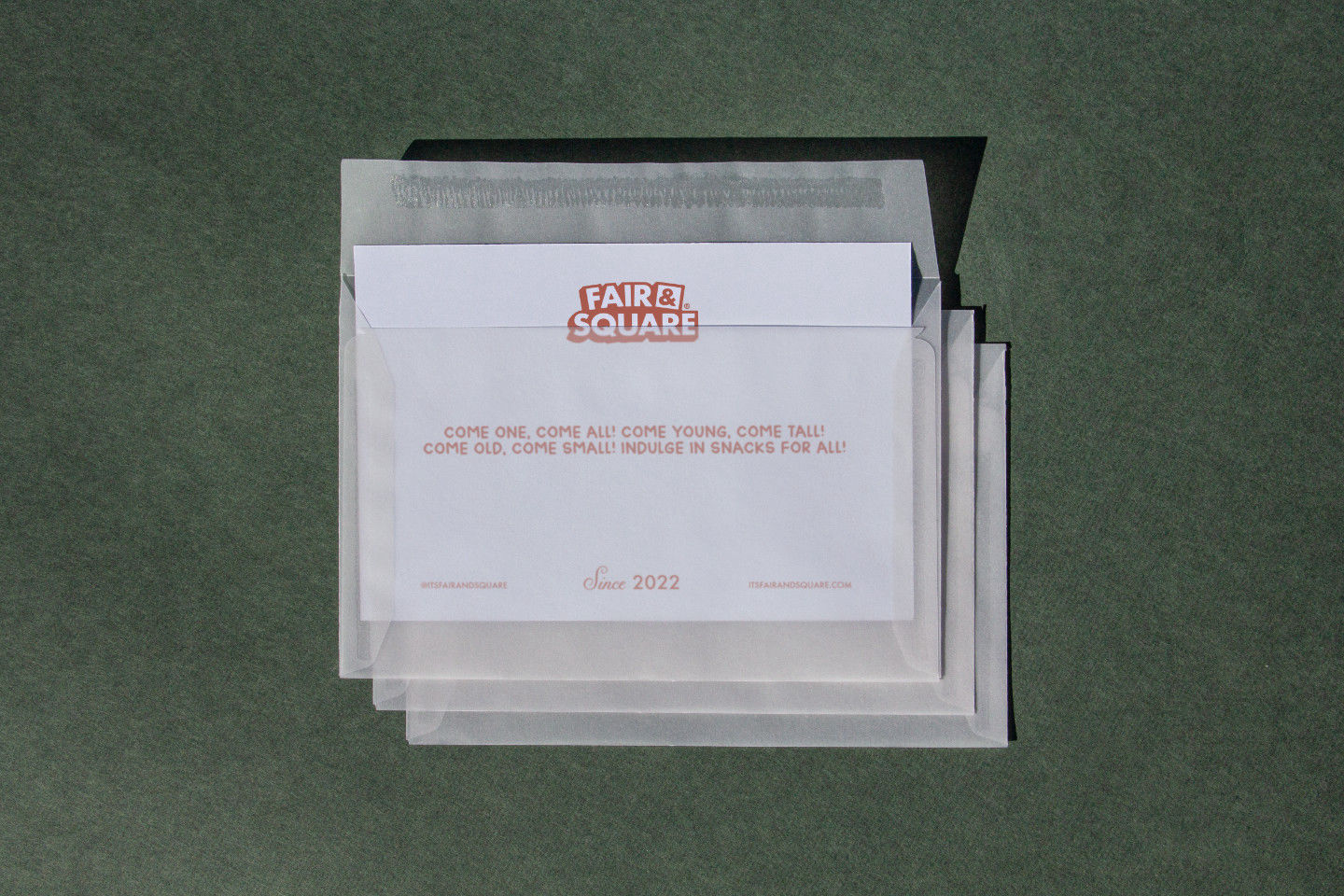
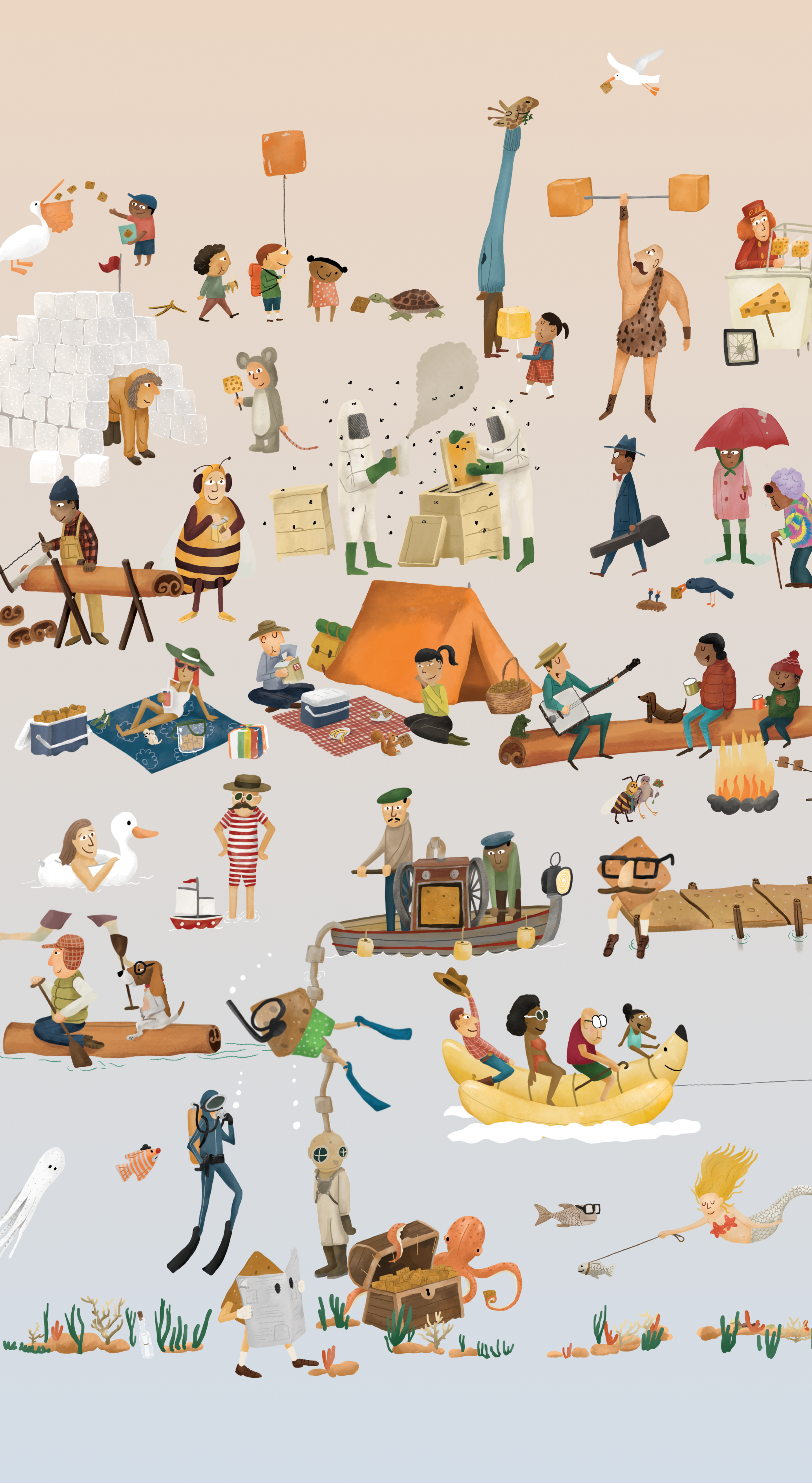
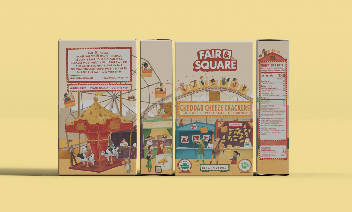
Cheese Me
Le Bloom
Explorer
Fat Miilk
Crystal Mountain
The Local
Loft+Lane
Double Zero
Jupiter
Catch
The Better Bagel
Tu Madre
In Good Taste
Jean Dousset
Last Crumb
Pocketbook Agency
House of Leon
Uncool Burgers
Moving Proz
Christina’s
GreenLight
Motto
Oshi
Koo Koo Roo
Old Faithful
rag & bone
Snibbs
Ripi
Lola Blankets
Korean Bros
Hire Us
Contact Us
Thank You!
We appreciate your interest in working with us

Thank You!
We appreciate your interest in working with us